Use the rich message/template components
This topic relates to Whispir’s Rich Message Studio (not to Whispir’s ‘classic’ messaging).
In the Rich Message Studio, messages and templates are created from a library of template components. Whispir provides a large selection of default components (for adding content such as text, images, buttons, maps and videos players) that you can use to craft your message or template. But you can also use them as a starting point for building and saving your own set of customised components.
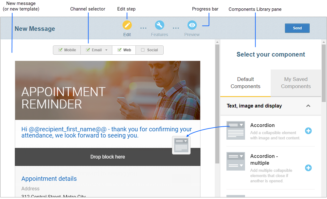
The Components Library pane is available only when you’re at the Edit step in the message or template creation process. All the components provided ‘out of the box’ appear on the Default Components tab in the Components Library pane. Any that you’ve already customised and saved are listed on the My Saved Components tab.
Important! The default components added in Whispir’s 2018 Brenner release (sometimes referred to as the ‘V4 components’) are not compatible with rich templates created in earlier versions of Whispir. All your older templates are still available and their components are still editable. However, you cannot add the new components to them. And any components you saved prior to the Brenner release can’t be added to new templates. To use the new components you can only add them to a new blank template or to any of the ready-made templates provided in the Brenner release.
Note: On the My Saved Components tab of the Components Library watch out for the icon with a blue triangle in the top right corner ![]() . It indicates your older saved components, which can’t be used with new messages or templates.
. It indicates your older saved components, which can’t be used with new messages or templates.
- Open a new rich message or template.
(Follow the steps in Create a new rich message, Create a new rich template from scratch or Create a new rich template from an existing one.) - Click Edit in the progress bar and select the channel you want to edit (such as Mobile, Email or Web).
- Find the required component in the Components Library by expanding the relevant category and add it either by clicking
 or dragging it.
Notes:
- The list of available components varies according to the channel you’re currently editing.
- Clicking
 adds a component to the bottom of the message or template. You can then move it to where it needs to go by hovering over it, clicking the move icon
  and dragging the component to its new position.
 - Dragging a component from the library lets you drop it exactly where you need it.
- Now go to Edit a component’s properties:.
You now need to update any content in the component and make any required changes to how it looks or behaves.
- Hover over the component in the template or message and click the edit icon
 .
.
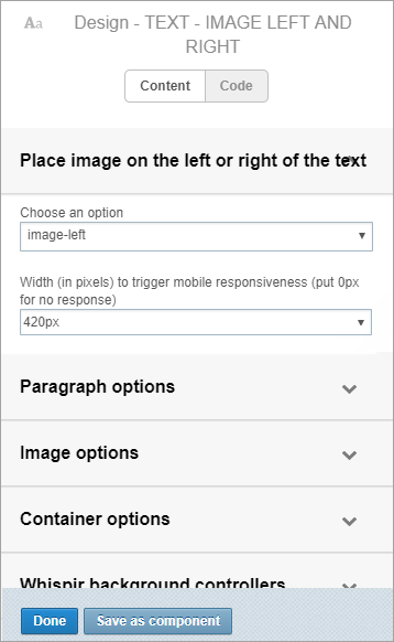
The editing pane opens on the right. It displays the component’s property types (such as ‘Paragraph options’ and ‘Container options’). The main property type is expanded automatically. - Expand a property type and add or edit the details.
The changes are immediately reflected in the content on the left. - Click Done to close the editing pane.
Note: Clicking Code in the editing pane switches to Code mode, with its 3 tabs: Markup, Properties and Scripts. Code mode can give you greater control over your changes but you should only use it if you’re experienced in editing HTML code.
The Components Library contains a wide selection of default components for adding to your rich message or template. Most are available in the Web channel, while others are specific to the Mobile, Email or Social (and Custom) channels. Expand the categories below to learn more about each component and where you can use it.
Warning! The components listed below were added in Whispir’s 2018 Brenner release. (They are sometimes referred to as the ‘V4 components’.)
Any templates you created in earlier Whispir releases are still available and their components are still editable. However, you cannot add the new components to any pre-existing templates. And any components you saved prior to the Brenner release can’t be added to new templates. To use the new components you can only add them to a new blank template or to any of the ready-made templates added in the Brenner release.
| Component | Description | Channels it’s available in | Comments | |||
|---|---|---|---|---|---|---|
| Web | Mobile | Social | ||||
|
Accordion |
Add a collapsible element with image and/or text content |
Yes |
– |
– |
– |
|
|
Accordion – multiple |
Add a group of collapsible elements (each closes if another is opened) |
Yes |
– |
– |
– |
|
|
Banner |
Add a background image, colour overlay, icon/image overlay, heading and subheading |
Yes |
Yes |
– |
– |
|
|
Branded header |
Add a branding mark and/or logo |
Yes |
Yes |
– |
– |
|
|
Carousel |
Add up to 6 images (with descriptions) that slide into view when clicked or swiped |
Yes |
– |
– |
– |
|
|
Configurable text |
Add text and choose a HTML tag style (h1, h2, h3, h4, p) |
Yes |
– |
– |
– |
Use this component to add a block of text that’s all one style. For example, add heading text and then style it as a h1, h2, h3 or h4 heading or as simple paragraph (p) text. |
|
|
Add a Facebook component |
– |
– |
– |
Yes |
|
|
Footer copyright |
Add a copyright message |
Yes |
Yes |
– |
– |
|
|
Footer social icons |
Add up to 5 social media icons with links |
Yes |
Yes |
– |
– |
|
|
Footer terms and conditions |
Add up to 5 text links |
Yes |
Yes |
– |
– |
|
|
Horizontal line |
Add a horizontal line to divide content |
Yes |
– |
– |
– |
|
|
Image |
Add an image and choose the source |
Yes |
Yes |
– |
– |
|
| Link button | Add a button with a link to a website or resource | – | Yes | – | – |
|
|
Plain text |
Add a plain text element |
– |
Yes |
Yes |
– |
|
|
Notice list |
Add multiple list items with labels and accompanying values |
Yes |
– |
– |
– |
|
|
Rich text editor |
Add text with your own inline styles |
Yes |
Yes |
– |
– |
|
|
Status report |
Add multiple event items, with coloured status indicators |
Yes |
– |
– |
– |
|
|
Text and image x 2 columns |
Add text and images in 2 columns |
– |
Yes |
– |
– |
|
|
Text and image x 3 columns |
Add text and images in 3 columns |
– |
Yes |
– |
– |
|
|
Text over image |
Add a background image with text overlay |
Yes |
– |
– |
– |
|
|
Text with image (position left or right) |
Add text with an image. Includes options for left-side or right-side position |
Yes |
– |
– |
– |
|
|
Text with image left |
Add text with an image on the left side |
– |
Yes |
– |
– |
|
|
Text with image right |
Add text with an image on the right side |
– |
Yes |
– |
– |
|
|
Title and subheading |
Add a title and optional subheading to your template |
Yes |
– |
– |
– |
|
|
|
Add a Twitter component |
– |
– |
– |
Yes |
|
|
–– Image (Classic component) |
Use the old Image component to add an image |
Yes |
Yes |
– |
– |
This is a Whispir legacy component* |
|
–– Image with text left (Classic component) |
Use the old Image with Text component to add text with an image on the left |
Yes |
Yes |
– |
– |
This is a Whispir legacy component* |
|
–– Image with text right (Classic component) |
Use the old Image with Text component to add text with an image on the right |
Yes |
Yes |
– |
– |
This is a Whispir legacy component* |
|
–– Map (Classic component) |
Use the old map component to add a map showing a particular location |
Yes |
– |
– |
– |
This is a Whispir legacy component* |
|
–– Rich text editor (Classic component) |
Use the old rich text editor component to add text with your own inline styles |
Yes |
Yes |
– |
– |
This is a Whispir legacy component* |
|
–– Spacer (Classic component) |
Add a small amount of space between two components |
Yes |
Yes |
– |
– |
This is a Whispir legacy component* |
*The legacy default components are ones that existed in Whispir prior to the 2018 Brenner release. You can use them with both new and old templates. Be aware that they’re not compatible with the Template Style Options components (that is, if you add a Template Style Options component, its style settings are not applied to the legacy components).
| Component | Description | Channels it’s available in | Comments | |||
|---|---|---|---|---|---|---|
| Web | Mobile | Social | ||||
|
Checkboxes |
Add up to 12 check box selections |
Yes |
– |
– |
– |
|
|
Date time picker |
Allow a date and time to be selected by a user |
Yes |
– |
– |
– |
Important! If you’re using this component in conjunction with the Date & Time Picker component in an Event Studio template, make sure that all parts of the date and time (day, month, year, hour, minute, seconds) are included. This ensures that the data will be successfully passed from a rich message to the corresponding event field. |
|
Tip! To modify the date time picker to accept 1 minute increments instead of the default 5 minutes:
For additional customisations visit https://flatpickr.js.org/options/ 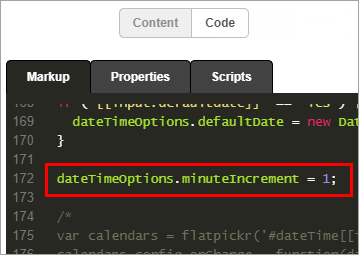
|
||||||
|
Dropdown list |
Add a drop-down list with up to 12 options |
Yes |
– |
– |
– |
|
|
Map |
Add a map to get, send or direct a user to or from a location |
Yes |
– |
– |
– |
|
|
Number slider |
Get rating feedback from 1 to 10 |
Yes |
– |
– |
– |
|
|
Percentage slider |
Get rating feedback from 0 to 100% |
Yes |
– |
– |
– |
|
|
Radio-buttons |
Add up to 12 radio button selections |
Yes |
– |
– |
|
|
|
Signature |
Capture a signature, with options for background image and pen styles |
Yes |
– |
– |
– |
|
|
Smiley face slider |
Get rating feedback with an interactive emoji icon |
Yes |
– |
– |
– |
|
|
Star rating |
Get rating feedback with stars |
Yes |
– |
– |
– |
|
|
Text input |
Add a text input field with RegEx validation |
Yes |
– |
– |
– |
|
|
Text input – multi-line |
Add a multi-line text input field, with options for minimum and maximum characters |
Yes |
– |
– |
– |
|
|
Thumbs up down |
Get a thumbs up or thumbs down response from a user |
Yes |
– |
– |
– |
|
|
Toggle switch |
Get a response from a user with a simple switch |
Yes |
– |
– |
– |
|
|
–– Video player (Classic component) |
Use the old Video player component to embed a YouTube video |
Yes |
– |
– |
– |
This is a Whispir legacy component* |
*The legacy default components are ones that existed in Whispir prior to the 2018 Brenner release. You can use them with both new and old templates. Be aware that they’re not compatible with the Template Style Options components (that is, if you add a Template Style Options component, its style settings are not applied to the legacy components).
| Component | Description | Channels it’s available in | Comments | |||
|---|---|---|---|---|---|---|
| Web | Mobile | Social | ||||
|
Add to calendar |
Allow a user to add an event to their calendar |
Yes |
– |
– |
– |
|
|
Add to contacts |
Allow a user to add a contact via a vCard (.vcf ), with options to remove image and text |
Yes |
– |
– |
– |
|
|
Call phone |
User is prompted to call the specified number |
Yes |
– |
– |
– |
|
|
Download app |
Open a link to the Apple App Store or Google Play on a mobile device |
Yes |
– |
– |
– |
|
|
Download file |
Downloads the specified file |
Yes |
– |
– |
– |
|
|
Get directions |
Open a Google map with directions from a user’s current location to a specified location |
Yes |
– |
– |
– |
|
|
Hide/Show |
Hide or show other components in a template using their visibility settings |
Yes |
– |
– |
– |
|
|
Hide/Show switch |
Turn off (or on) the visibility of a set of components |
Yes |
– |
– |
– |
|
|
Link |
Link to a page or file |
Yes |
– |
– |
– |
|
|
Submit |
Submit the data collected in your template components, processed through the Whispir platform |
Yes |
– |
– |
– |
|
|
Use camera/Upload file |
Access a user’s mobile camera OR upload a file from their desktop (with an option to change the icon) |
Yes |
– |
– |
– |
|
|
Yes/No |
Get a simple Yes or No response from a user |
Yes |
– |
– |
– |
|
|
–– Download file (Classic component) |
Add a link to a file (such as an image or document) that users can then view or download |
Yes |
Yes |
– |
– |
This is a Whispir legacy component* |
*The legacy default components are ones that existed in Whispir prior to the 2018 Brenner release. You can use them with both new and old templates. Be aware that they’re not compatible with the Template Style Options components (that is, if you add a Template Style Options component, its style settings are not applied to the legacy components).
| Component | Description | Channels it’s available in | Comments | |||
|---|---|---|---|---|---|---|
| Web | Mobile | Social | ||||
|
Audio player |
Add an audio player container (supported formats: .mpeg, .ogg, .wav) |
Yes |
– |
– |
– |
|
|
Video player |
Add a video player container (supported formats: YouTube, Vimeo, Daily Motion, Wistia) |
Yes |
– |
– |
– |
|
| Component | Description | Channels it’s available in | Comments | |||
|---|---|---|---|---|---|---|
| Web | Mobile | Social | ||||
|
Attachment viewer |
Allow any files attached to a message that uses this template to be viewed from the web page |
Yes |
– |
– |
– |
Adding this component to the Web channel allows any files you attach to a message that uses this template to be viewable or downloadable from the web page. This includes image files and document files. The attachments will be viewable even if the message is sent only via the Mobile channel. Tip! Ensure you include the @@web_link@@ tag in the Mobile and/or Email channels in the message. |
|
Skeleton-component |
Use this component as a starting point for developing your own components |
Yes |
– |
– |
– |
This is a component for advanced users. It comes with a full suite of editable properties that allow you to build and format the component’s content and look-and-feel in any way you need. Tip! Once you’ve finalised the component changes click Save as component to add it to the My Saved Components tab, ready for using any time you need it. |
The Shared Template Styles components are only available in the Web channel. See Use the Shared Template Styles components for more information about using them.
| Component | Description | Channels it’s available in | Comments | |||
|---|---|---|---|---|---|---|
| Web | Mobile | Social | ||||
|
Shared template styles – Default |
Control graphic styles shared throughout a template |
Yes |
– |
– |
– |
The theme colour is black. |
|
Shared template styles – example 1 |
Control graphic styles shared throughout a template |
Yes |
– |
– |
– |
The theme colour is blue. |
|
Shared template styles – example 2 |
Control graphic styles shared throughout a template |
Yes |
– |
– |
– |
The theme colour is green. |
|
Shared template styles – example 3 |
Control graphic styles shared throughout a template |
Yes |
– |
– |
– |
The theme colour is red. |
- Open a new message or template.
(Follow the steps in Create a new rich message, Create a new rich template from scratch and Create a new rich template from an existing one.) - At the Edit step select the relevant channel (such as Mobile, Email or Web).
- Do either of the following:
- If you’re using a ready-made template identify which component in the template you want to save as a new component.
- If you want to edit and save a default component (or any component already on the My Saved Components tab) either click
 beside it in the Components Library or drag it onto the message or template.
Note: On the My Saved Components tab of the Components Library watch out for the icon with a blue triangle in the top right corner
 . It indicates your older saved components, which can’t be used with new messages or templates.
 - Hover your mouse over the component and click the edit icon
 .
.
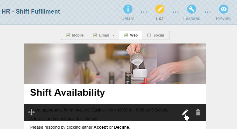
The editing pane opens on the right in Content mode. It displays the component’s editable properties, grouped by property type. The main property type is expanded automatically.
Note: Clicking Code switches to Code mode. It can give you greater control over your changes but you should only use it if you’re experienced in editing HTML code.
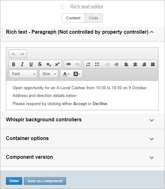
- Edit the component’s properties, as required.
- Click Save as component.
- In the Component Name field enter a name.
Choose a meaningful name that easily identifies the purpose of the component. - (optional) Enter a description for the component.
- Leave the Share Component Across All Workspaces check box clear.
Important! The Share Component Across All Workspaces check box lets you share this component with all other users. However, this has the potential to quickly fill up everyone’s My Saved Components section with components they don’t need or don’t recognise. And if you delete a shared component you also delete it for everyone else. Whispir recommends that you avoid selecting the check box unless you’re sure it’s safe to share the component.
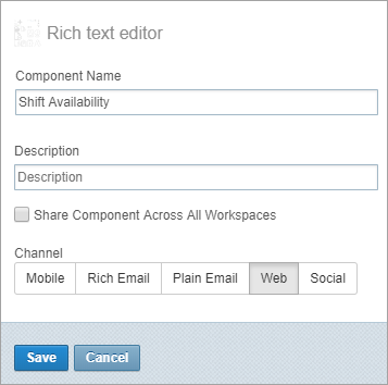
- Use the buttons in the channel selector to make your component available to other channels.
For example, if you want a web component to also be available for use in emails click the Rich Email button. You’ll be able to add the component to the email channel from the My Saved Components tab. - Click Save.
The component is now saved to the My Saved Components tab of the Components Library.
Note: Selecting multiple channels doesn’t always guarantee that your new saved component can be used on that channel. For example, on the Mobile channel you can only add a plain text component. A warning message displays if you try to add a saved component that’s not compatible.
